MOZII E-cOMMERcE PlATFOrM
About
Founded in 2019, Mozii is a B2B e-commerce wholesale platform dedicated to creating a seamless and cost-effective experience for international suppliers and consumers. Mozii’s mission is to develop an infrastructure that facilitates effortless transactions and interactions internationally. This platform offers significant advantages to suppliers of clothing, accessories, and other merchandise by providing a streamlined process for listing, managing, and selling their products. By leveraging Mozii, suppliers can easily reach a global market, reduce operational costs, and enhance their distribution efficiency, ensuring a smooth and profitable experience for consumers.
Project Overview
ROLES
⟡ PRODUCT DESIGNER ⟡ MARKET RESEARCHER ⟡ PRODUCT MANAGER⟡
TOOLS
⟡ SKETCH ⟡ ADOBE ILLUSTRATOR ⟡ PROCREATE ⟡ PHOTOSHOP ⟡
PROJECTS DISPLAYED
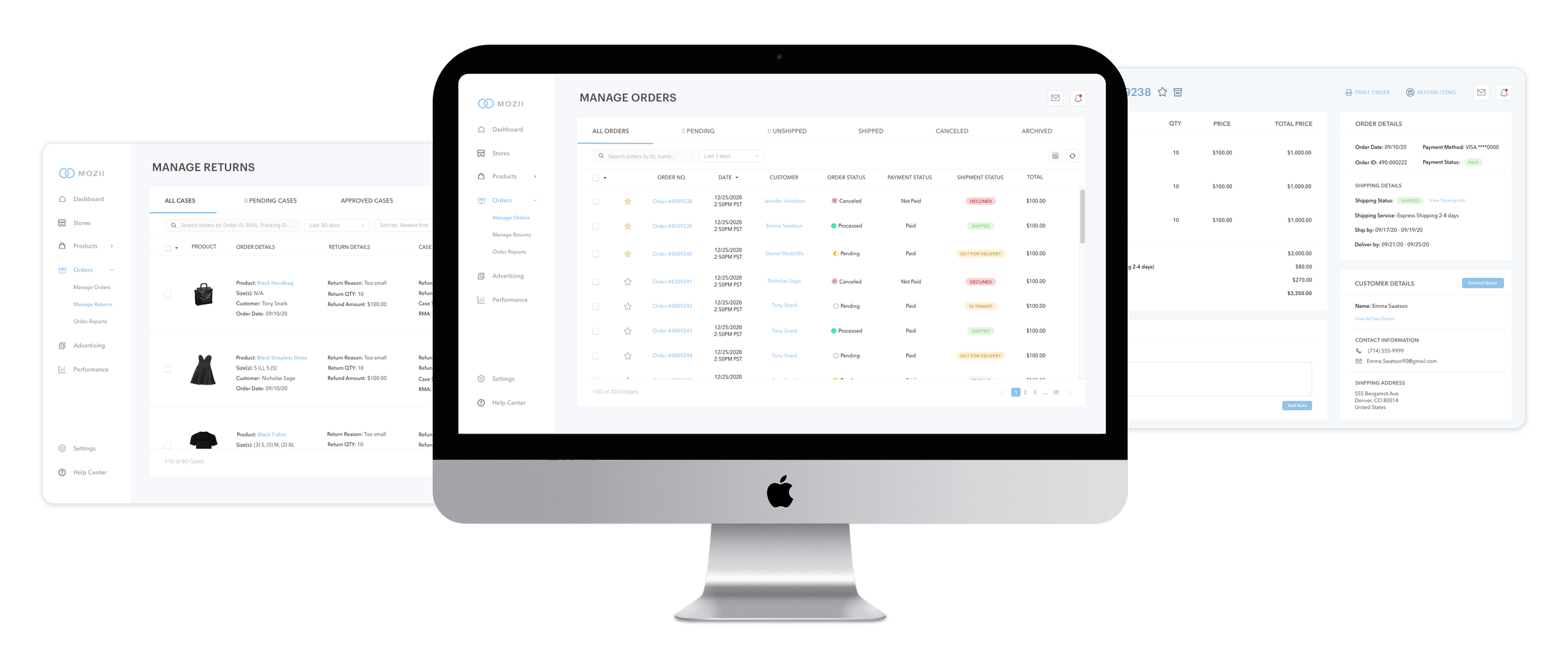
⟡ SELLER’S DASHBOARD
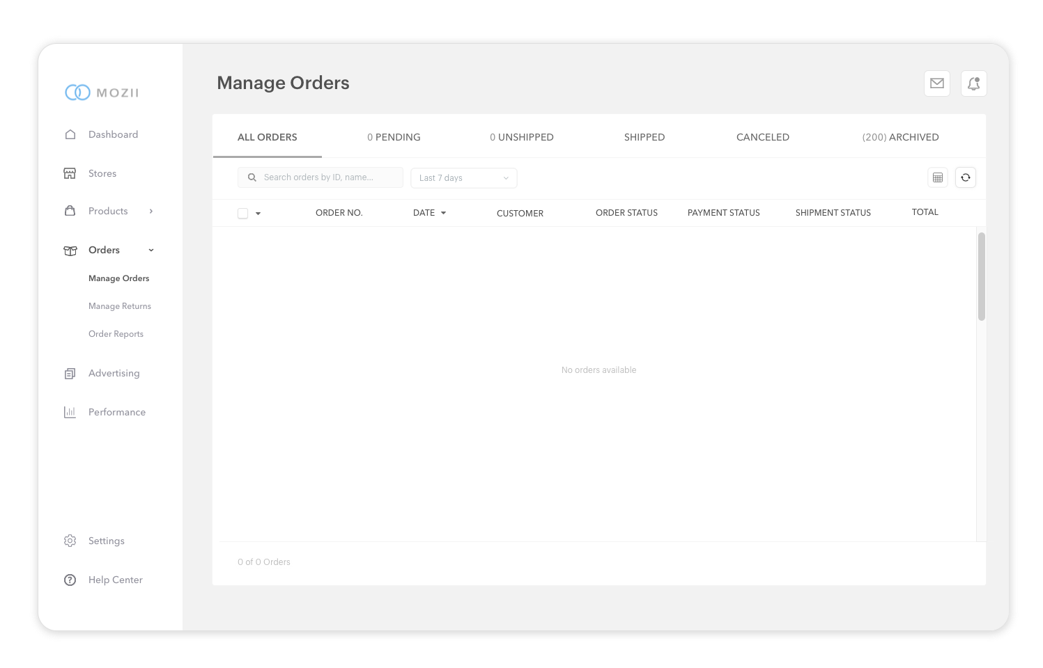
MANAGE ORDERS
MANAGE RETURNS
TIMELINE
⟡ 6 WEEKS
CHALLENGES
Design a new seller’s dashboard so that suppliers could seamlessly navigate through their orders within a few simple steps without all of the cluttered text and buttons
Research
MARKET RESEARCH
I conducted market research to learn more about the demographics and trends of the e-commerce industry. Through extensive research and competitive analyses, I was able to gain a deeper understanding about the industry and learn more about the competitors. I have included some of the strengths and weaknesses in regard to the company as a whole and their user experience process.
B2B E-COMMERCE TRENDS
According to Big Commerce, there is a higher demand for fast B2B order fulfillment in 2021
Asia makes up approximately 80 % of the global B2B e-commerce market
According to McKinsey, focusing on the customer experience, starting from front-end sales to ongoing support, can increase revenue by 5% to 10%
97% of B2B buyers said it was important that vendor websites provided easy access to content (DemandBase, 2020)
According to Time, using infinite scrolling can lower a site’s bounce rate
94% of impressions are design related (Big Commerce, 2020)
Competitive Analyses
DEMOGRAPHIC
In 2021, 58% of amazon sellers are between the ages of 25-44 years old
STRENGTHS
Low cost structure
Amazon has 38.7% of the e-commerce market in the US
Amazon has the highest average growth rate inn comparison to other U.S. e-commerce companies
WEAKNESSES
Focus is on North American market; other emerging markets acquired by competitors
Fradulent reviews of Amazon products
Amazon Seller Central lacks color and design elements
DIRECT COMPETITORS
DEMOGRAPHIC
The average age of sellers is 45 years old
STRENGTHS
In 2020, Alibaba accounted for 53.3% of China’s eCommerce retail market
As of 2019, Alibaba’s buyers are located in over 190 countries across the globe
According to Beijing Review, Alibaba is predicted to increase their cross-border customer base to 30 million by 2030
WEAKNESSES
International markets account for only 10% of Alibaba’s revenue
68% of Alibaba’s revenue comes from Chinese eCommerce retail sales (Statista)
Alibaba’s seller platform has bugs and incomplete designs
Alibaba seller platform is not user-friendly for first-time sellers
DEMOGRAPHIC
28% of Ebay sellers are located in the United States (Statista, 2019)
STRENGTHS
Prebuilt infrastructure that allows first time sellers to focus on marketing the product
In 2021, Ebay’s sales has shown strong growth in international transactions
Provides B2B, B2C, and C2C services
WEAKNESSES
Limited support with customer service
Online fraud and scams that can deter users from buying on Ebay
Ebay has technical issues and bugs that affects the sellers’ and buyers’ experience
No growth strategy to sustain its growth
User Interview
GOALS
Determine the main issues that users run into when navigating through an e-commerce wholesale platform
How important is a minimalistic, simple and clean seller’s dashboard system
Pinpointing struggles of first time users on these seller platforms
How much is considered “too much content or information” which can cause information overload
Determining which platforms were easier and harder to navigate
The important aspects of an order management system
PARTICIPANTS
I recruiter a total of 6 participants (3 from each subreddit group). I assigned 6 participants to review all three of the e-commerce platforms: Amazon Seller Central, Alibaba.com, Ebay. I started off with general questions as ice breakers and then I asked open ended questions to gather more insight on the participants’ challenges with the seller’s platforms.
SUBREDDITS
r/eCommerce (150k members)
r/smallbusiness (633k members)
Key Findings
100% felt Ebay’s seller hub lacked a lot of aesthetic UI elements making the page plain
83% of people believed that Alibaba’s Seller Central was not intuitive for first time users; it was difficult to navigate through the orders management tab
100% said that Amazon Seller Central was the easiest to navigate
83% said that it wasn’t too difficult to get to the orders management system although the order management had too much clutter and it was difficult to navigate through at first glance (Alibaba and Ebay)
67% believed that the amount of information on the dashboard is overwhelming
50% stated that it is important to have an organized and intuitive order management system since sellers will be managing a lot of orders
33% said that all of the e-commerce platforms needed a simple dashboard that included all of the important seller information and statistics
Empathy Mapping
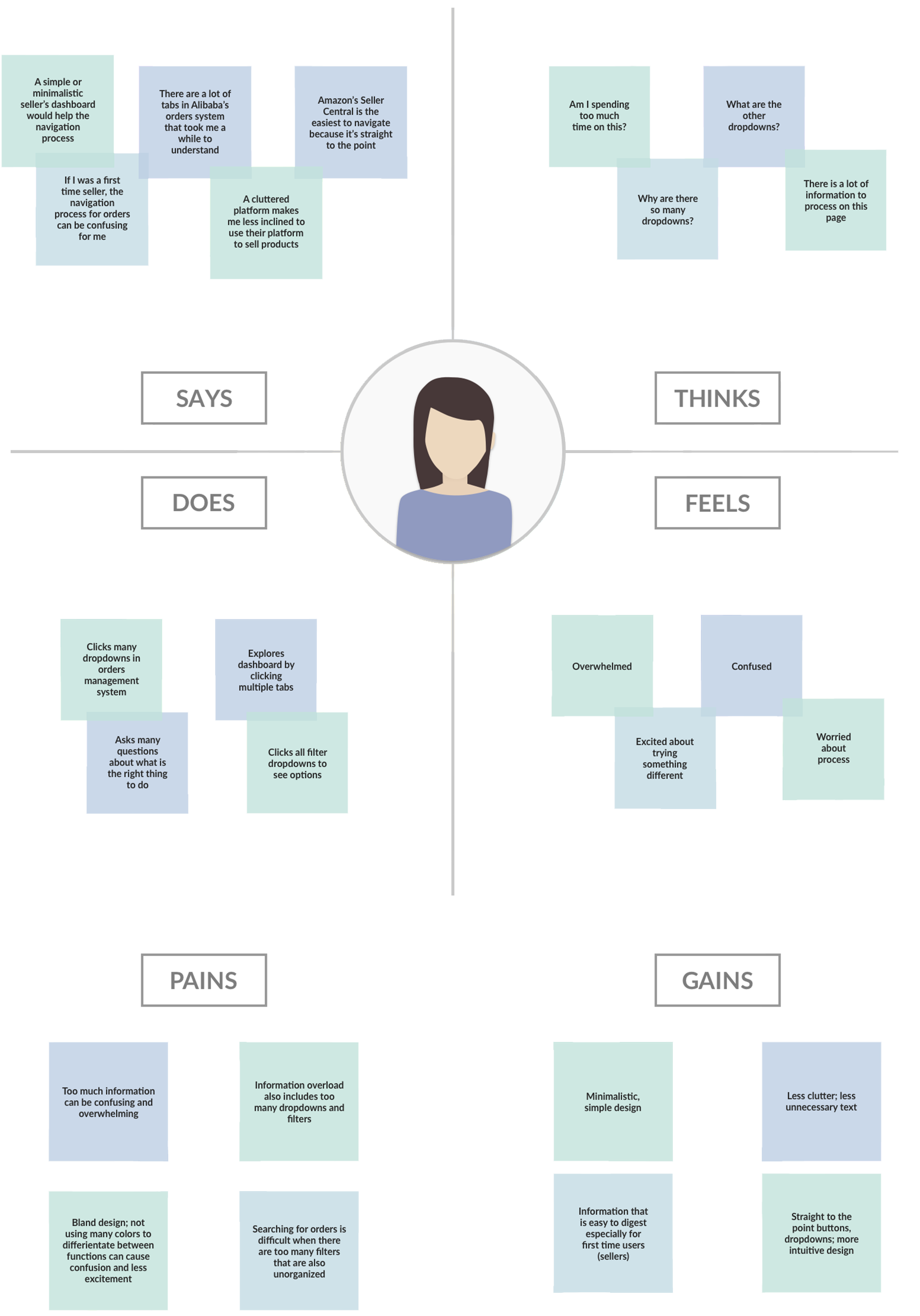
During the user interviews, I gathered information and gained more insight on the average e-commerce user. I was able to identify common patterns by creating an empathy map which explained the users’ thoughts, actions, and feelings throughout the interview process.
User Personas
After discovering common themes and patterns from my empathy map, I was able to create user personas that reflected the average users’ goals and frustrations.
SOPHIE
28 years old
Home Decor Finatic
Aspiring Entrepreneur; wants to open
a business selling furniture and other home decor
BRENT
35 years old
Tech-Savvy
Owns a business in the tech industry;
sells smart home tech
JENNA
45 years old
Environmentally-Friendly
Runs a business selling eco-friendly products;
has 5 employees managing her business
GOALS
“I am currently in business school while trying to open up a business selling home decor. If the selling process was intuitive, it wouldn’t be so daunting or intimidating.”
FRUSTRATIONS
“There are too many tabs and drop-downs that can be simplified in the order management system.”
“I don’t understand all of the drop-downs; I have to do research to figure out what some of the drop-downs mean.”
GOALS
“As someone who has a passion for smart tech, efficiency is important to me. A seamless and efficient experience is on of the ways a business can truly succeed.”
FRUSTRATIONS
“The order management systems tend to have an overwhelming amount of text. It’s difficult to quickly navigate through the orders.”
GOALS
“It’s crucial that my business can thrive while also making seller transactions easier for my employees so that they aren’t spending too much time figuring out the process.”
FRUSTRATIONS
“Finding an order should be easier and quicker if there were better search tools and filters.”
“Return requests can be fulfilled in a timely manner if there weren’t so many buttons and tabs.”
PROBLEMS
People want drop-downs, filters, and buttons that feel intuitive; too many buttons or text can feel overwhelming especially for first time users
New users can be intimidated by the order and return management process if there are too many tabs and words that they’re not familiar with
People want to fulfill return requests in a few easy steps without having to contact customer support
NEEDS
To easily navigate through orders and returns without trying to figure out the process through trial and error
To understand the words in all (or most) of the categories, tabs, drop-downs, and buttons
To fulfill return requests in a timely manner on their own
MEET OUR 3 USERS
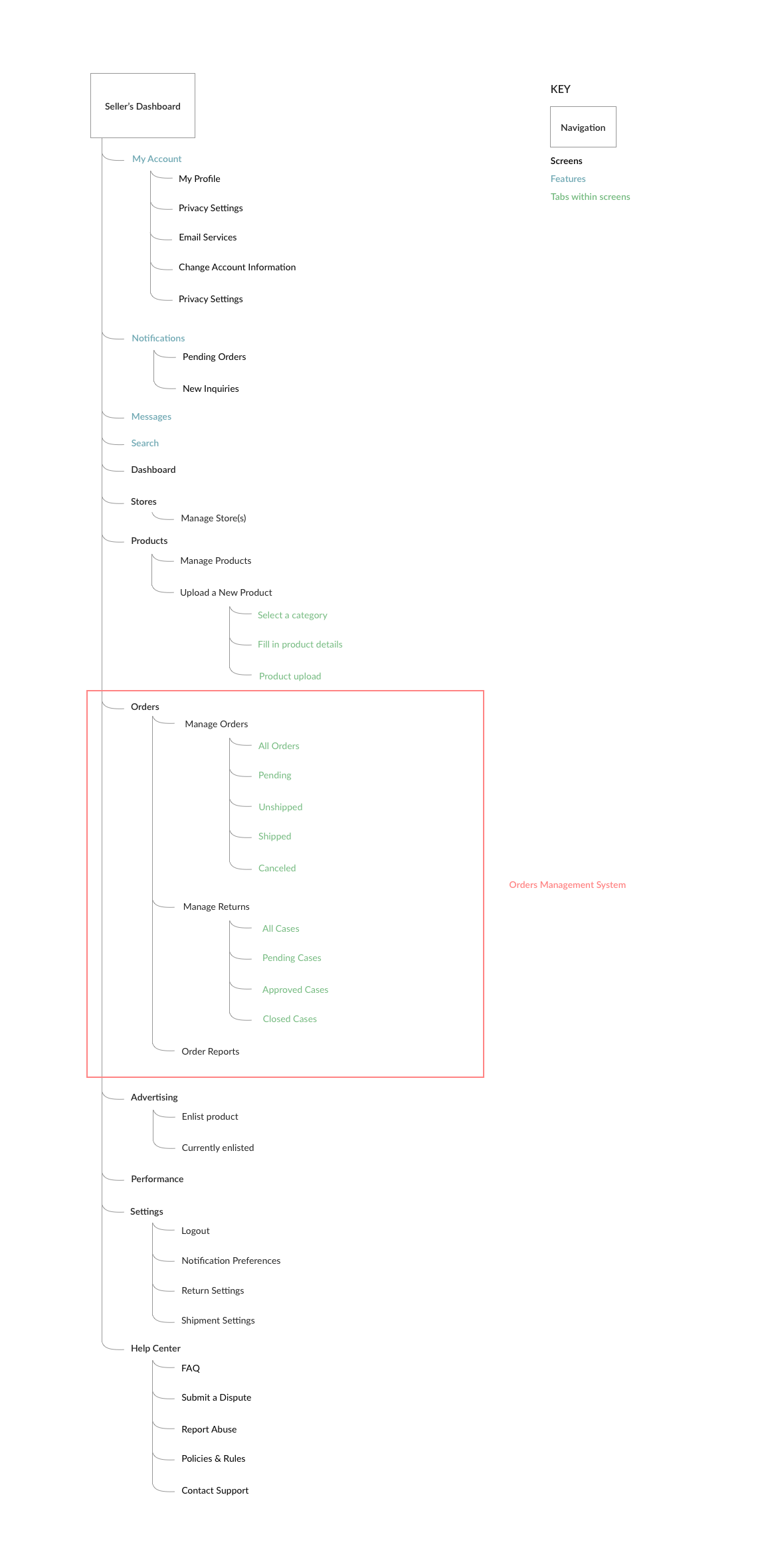
Application Map
Closed Card Sorting
I wanted to organize table preferences in the orders management tab. In a separate interview, I asked 6 participants to sort out the table preferences and place them under the categories that was the most fitting. The success rate of each participant was calculated by a 12 point system; each table preference is 1 point.
TASK: ORGANIZE TABLE PREFERENCES
RESULTS
Participant #1: 100% success rate
Participant #2: 91% success rate
Participant #3: 83% success rate
Participant #4: 100% success rate
Participant #5: 91% success rate
Participant #6: 100% success rate
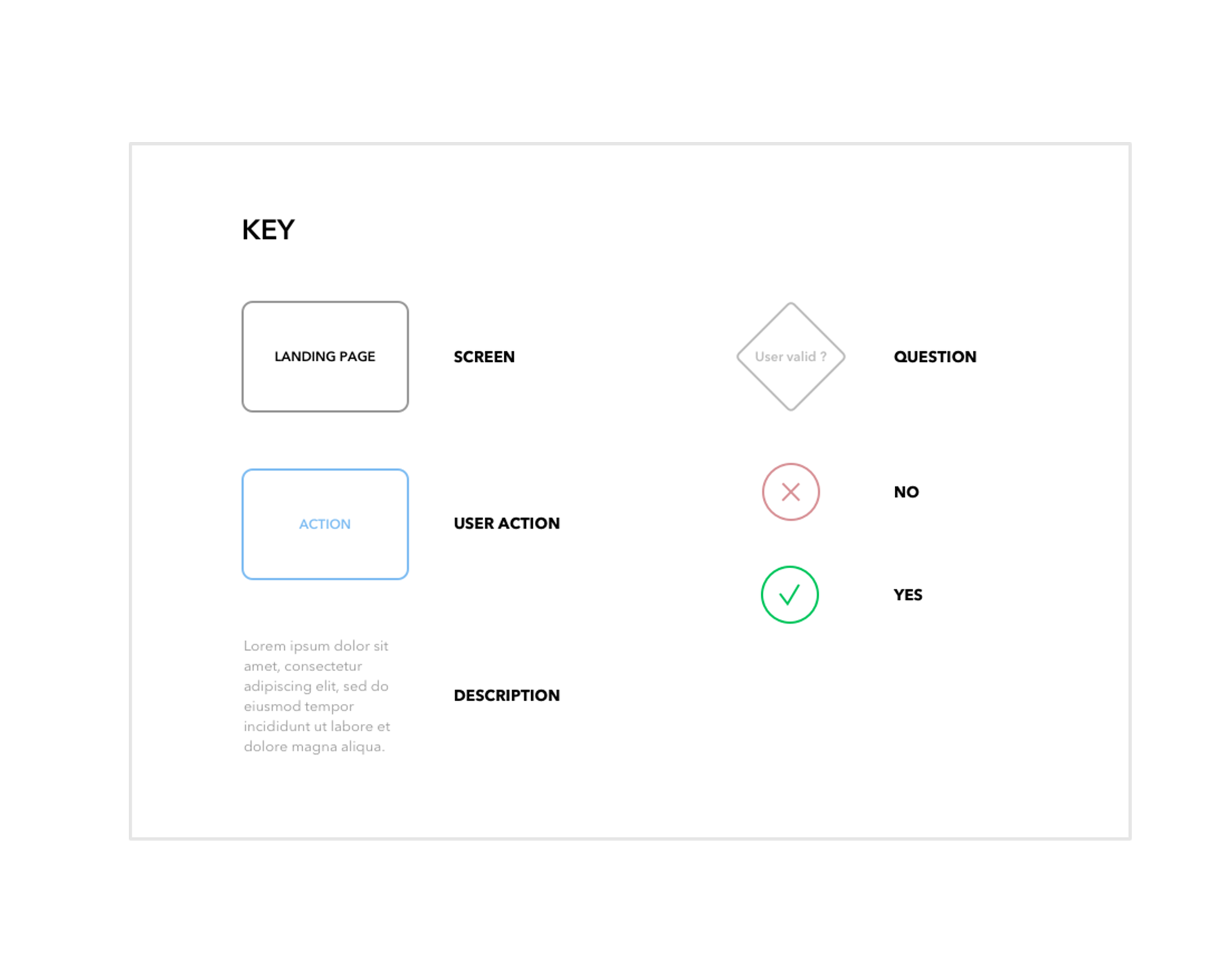
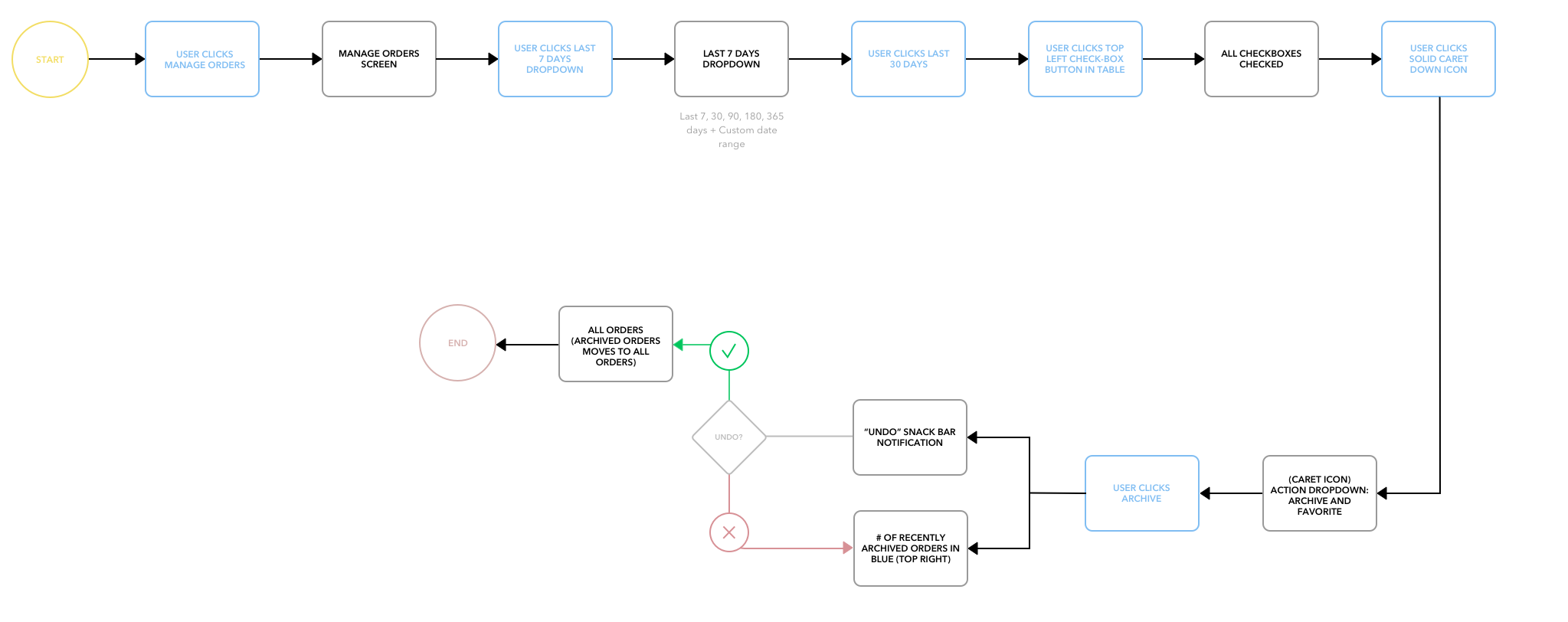
User Flow
Wireframes
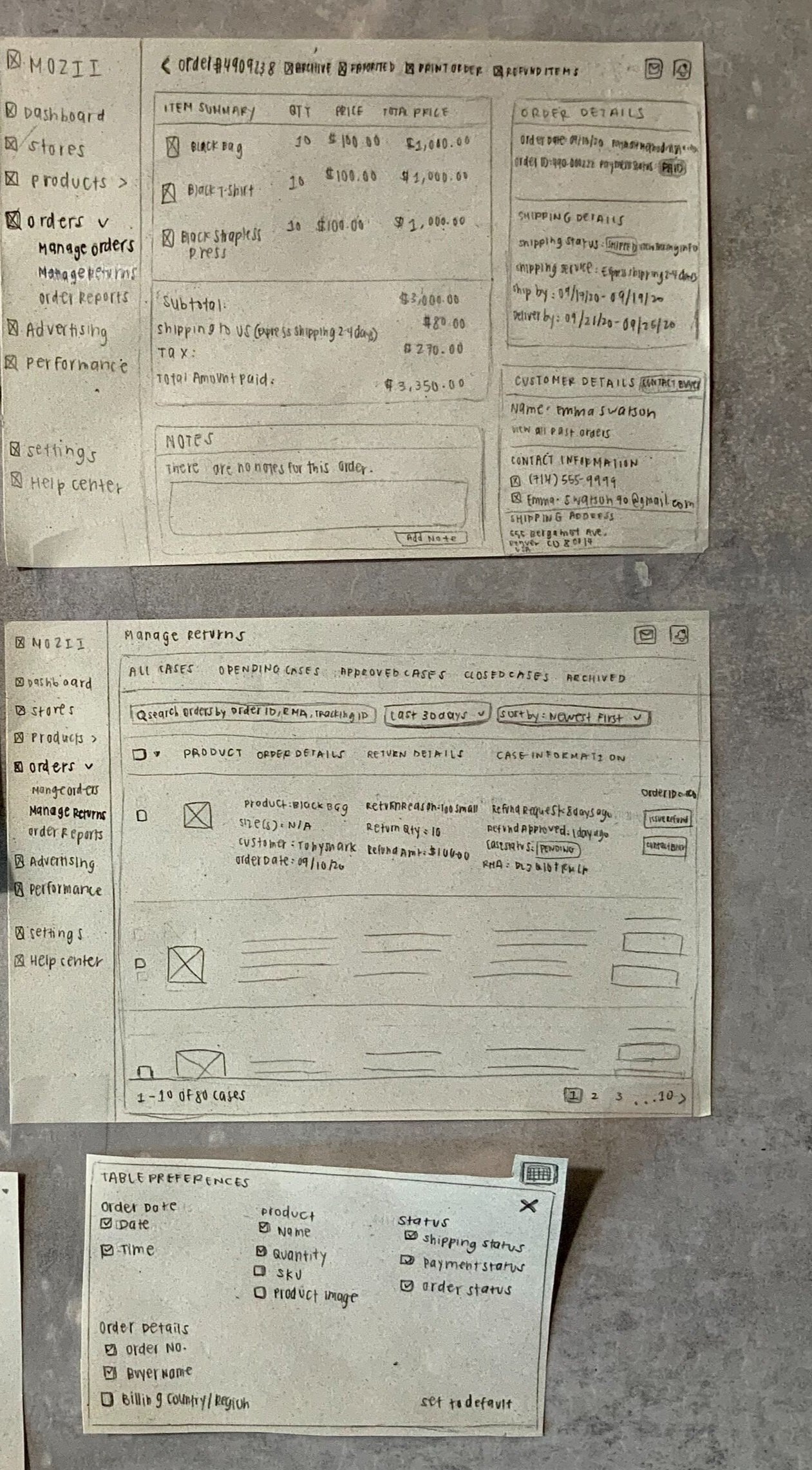
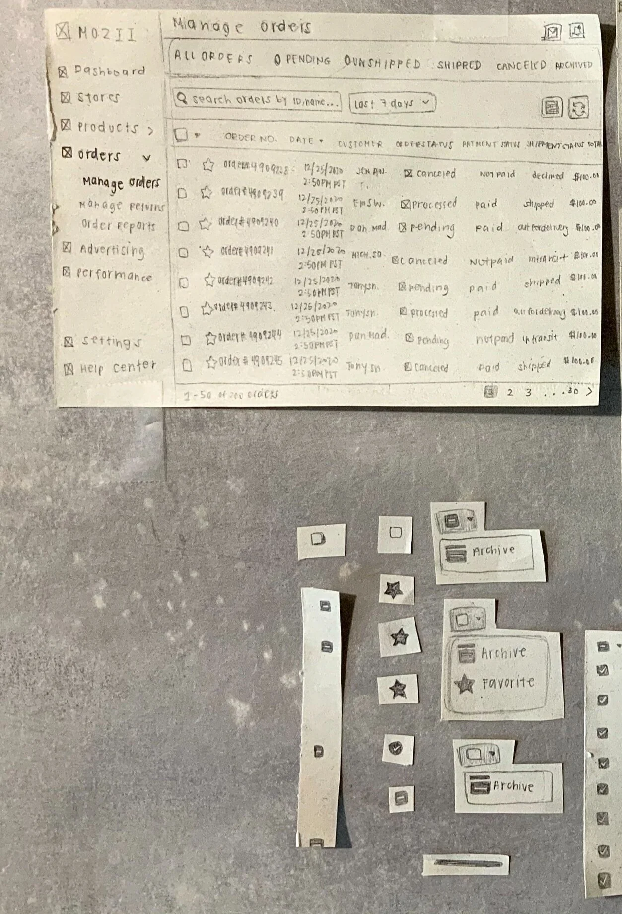
LOW FIDELITY WIREFRAMES
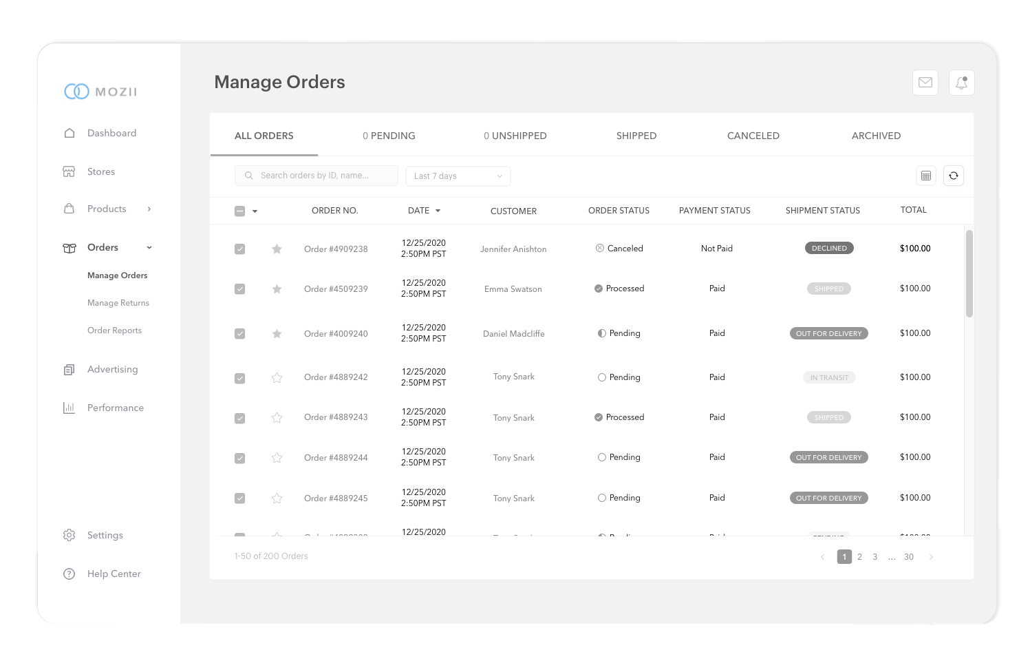
MID FIDELITY WIREFRAMES
ORDERS
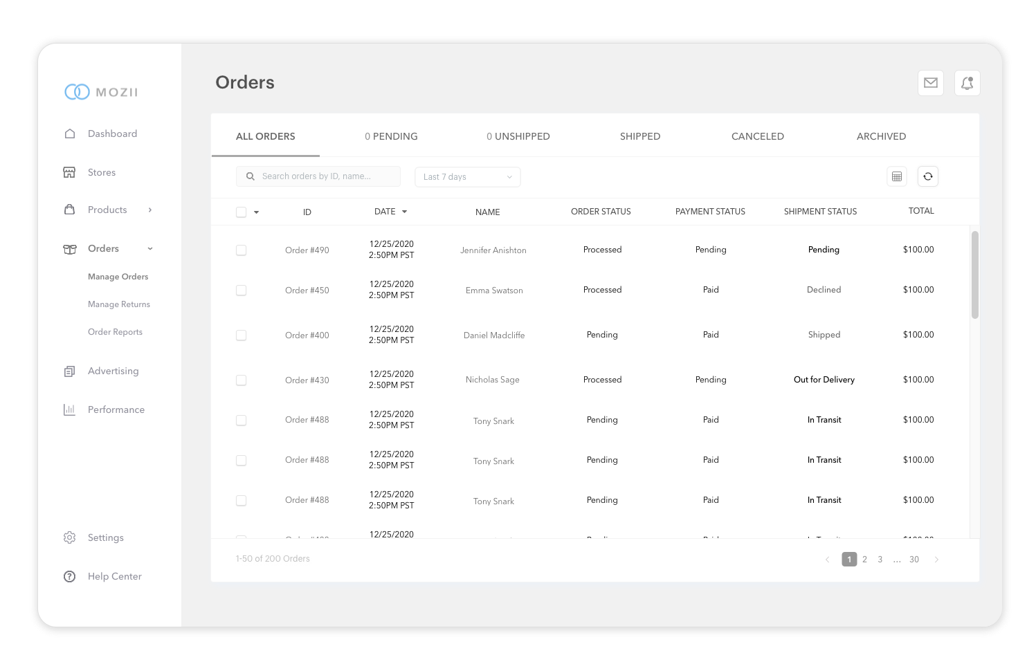
1. MANAGE ORDERS (ALL ORDERS)
6. MANAGE ORDERS: DROPDOWN
2. MANAGE ORDERS (FAVORITED)
5. MANAGE ORDERS: CHECK ALL ORDERS
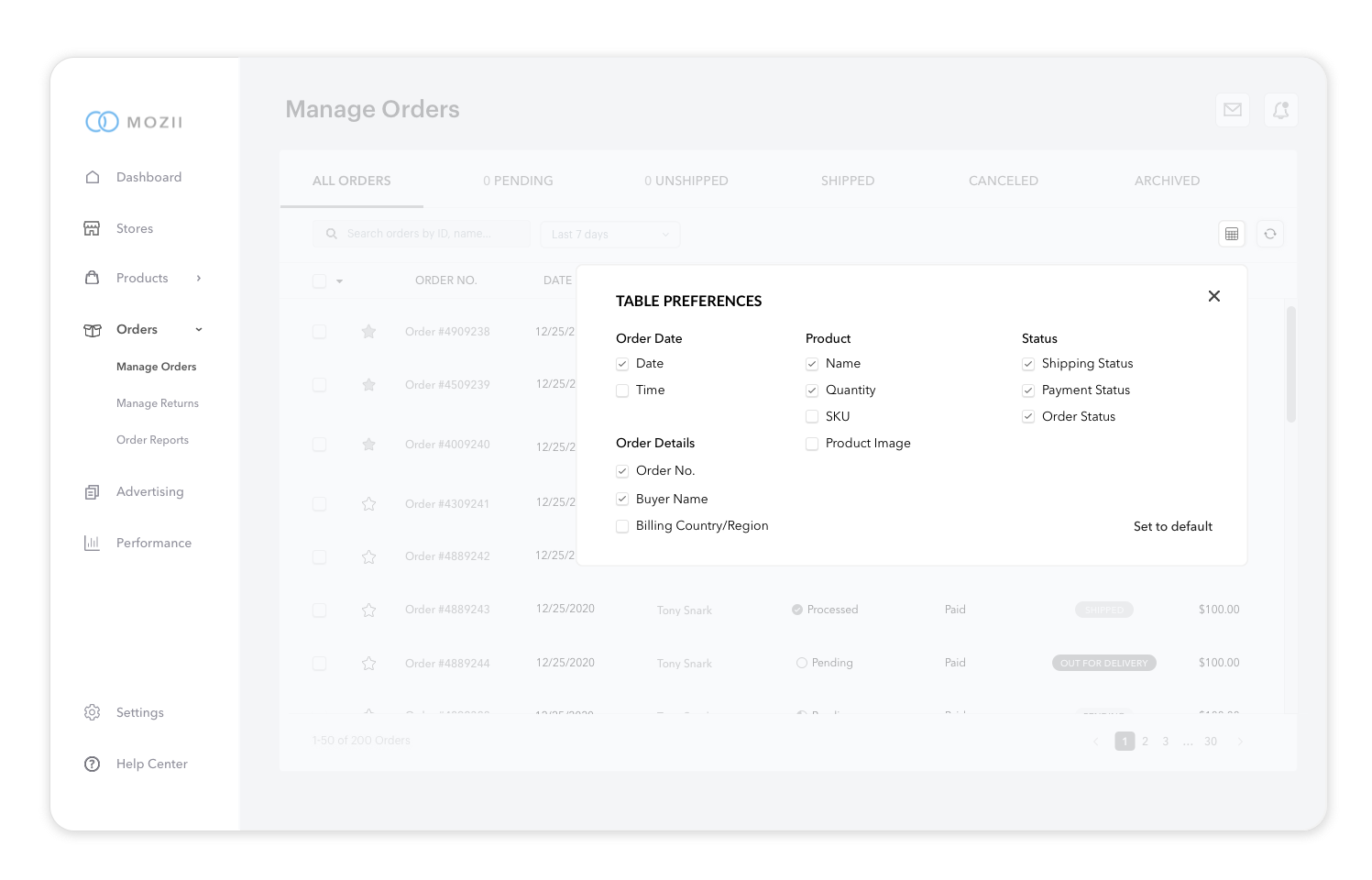
3. MANAGE ORDERS: TABLE PREFERENCES
4. MANAGE ORDERS: ORDER #
RETURNS
1. MANAGE RETURNS (ALL CASES)
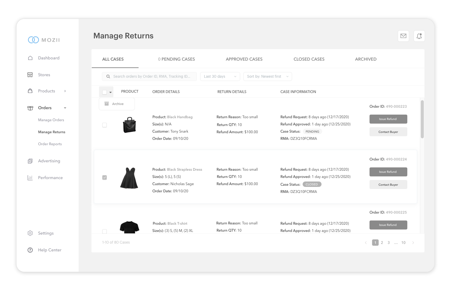
2. MANAGE RETURNS (CHECK ONE ITEM)
A/B tests were performed to determine which designs users liked more. A total of 4 participants were recruited for all A/B and Usability Tests. A majority (75%) of users chose the first screen during the first A&B testing.
A B Testing
A)
B)
/
75% of users liked this order management screen more because of the UI elements and how visually appealing it is in comparison to the other screen. The users liked that they had the option to favorite their orders.
“Manage Orders is much more detailed than Orders because Orders seems too general.”
15% of users liked this screen more because it seemed more “minimalistic” and simple in comparison to the other screen.
The other 75% of users felt that the plain text under payment status and shipment status on this screen were “too dull” and didn’t pop.
TASKS
Favorite the first three orders under “Manage Orders”
Uncheck the “Time” under “Table Preferences”
Archive Order #4309241
Archive all orders
Unarchive all orders
Find Order Details for Order #4909238
Navigate to returns
Archive returned order cases with Order ID #490-000224
Archive all return order cases
Find Archived orders
TESTING
Participants: 4
Method: Remote Think Aloud Testing through Zoom
RESULTS
Average Time: 2 minutes
Task-Completion Rate: 100%
Error-Free Rate: 80%
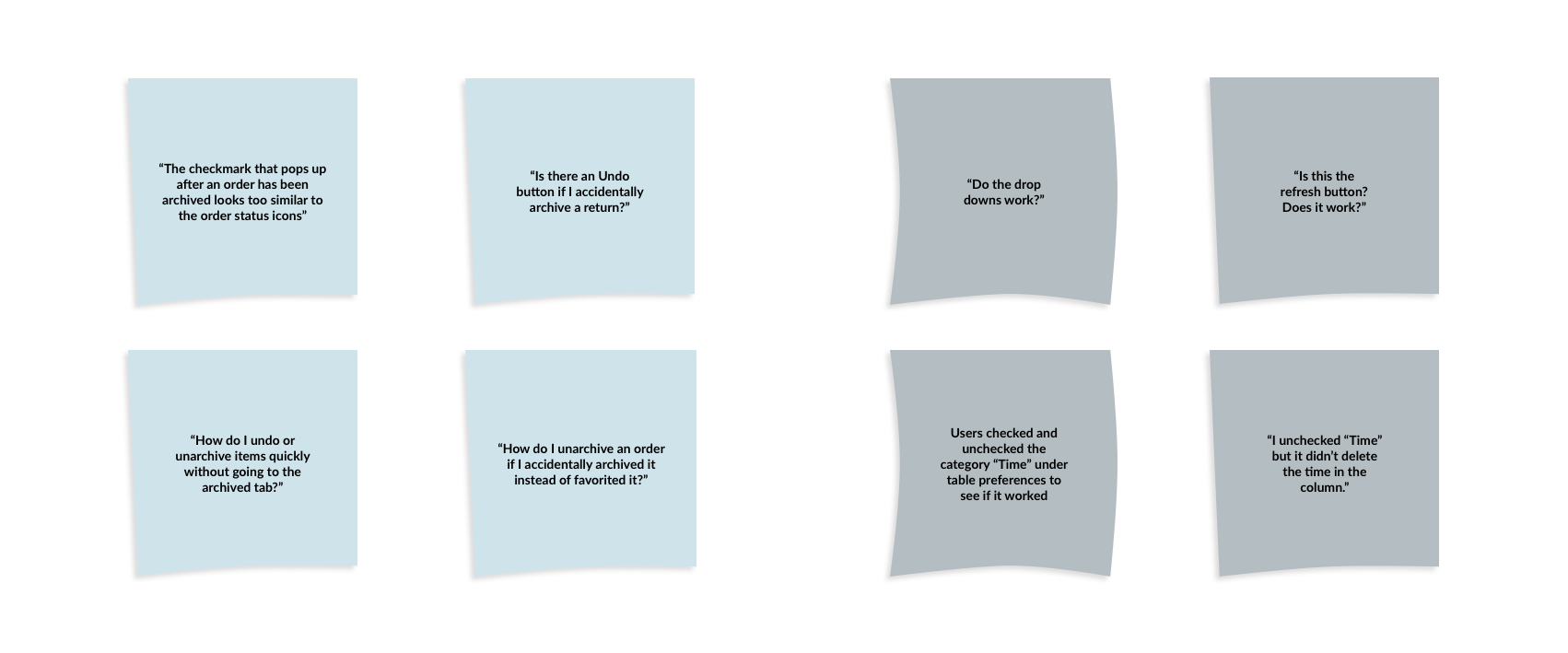
With the notes and observations I collected during the usability test, I was able to create an affinity map to gain a deeper understanding of the users' thoughts and feelings throughout the process. The affinity map allowed me to gain more insight and uncover some of the themes and patterns.
Affinity Map
Pain Points
People want to have the ability to try out different buttons and drop-downs even if it might not be the correct action.
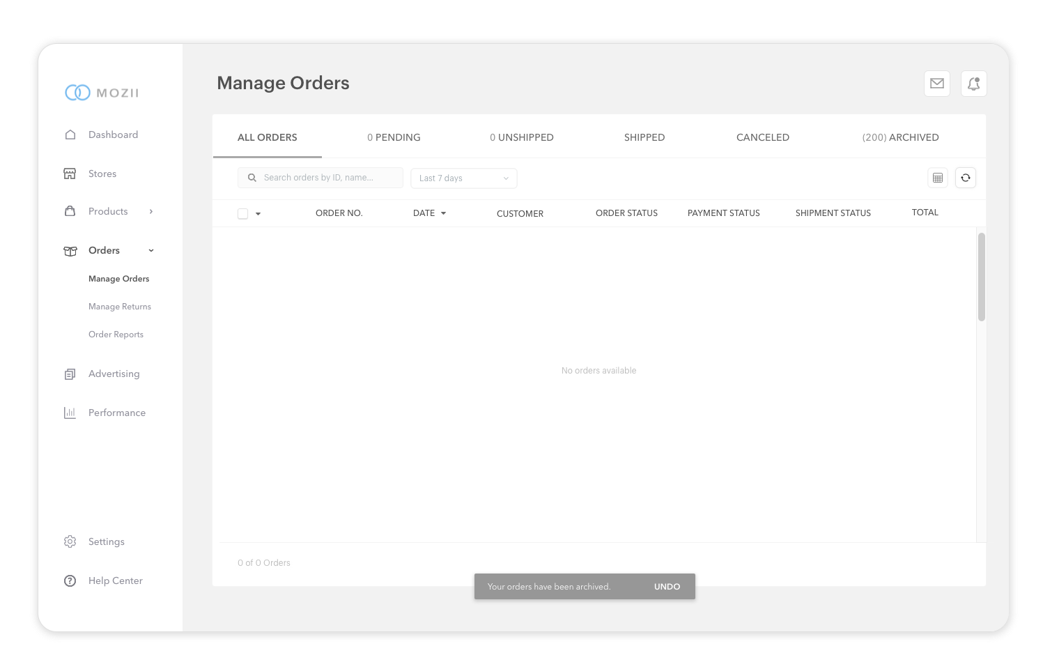
People want the ability to undo an action especially if they are archiving multiple orders and returns.
People like having notifications for each action although they want the notifications to be consistent in design so that it feels more intuitive.
Recommendations
Allow users to uncheck and check the category “Time” in the table preferences before exiting out of it
Create a snack bar with an “Undo” option after orders or returns are archived
Re-design “Archived” notification after orders or returns are archived
Create and/or link drop downs and refresh button so that users can see the functions live
Revisions
1. Create a snack bar with an “Undo” option after orders or returns are archived
2. Re-design “Archived” notification after orders or returns are archived
After completing the mid-fidelity wireframes for the order management system (manage orders, manage returns), I recruited 4 participants and conducted a remote Think Aloud testing through Zoom. The users were asked to share what they were thinking and feeling while interacting with the mid-fidelity prototype and completing the task that were given to them. The purpose of this test was to gather information on which features were intuitive and efficient. The goal of the test was to also have users complete 10 tasks in about 2-3 minutes.
Usability Testing
BEFORE
AFTER
BEFORE
AFTER
A B Testing: High Fidelity Wireframes
/
During the revision process, I changed a few UI elements for the order management and order return screen. I conducted an A/B test with the same 5 participants from the previous A/B test. The participants were given two sets of high-fidelity wireframes to choose from.
SET 1: LAST 7 DAYS DROP-DOWN BORDER
75% of users chose this drop-down design because the drop-down design looked like a standard drop-down.
“The blue border looks like it highlights the drop-down and it doesn’t feel like a standard drop-down design I’ve seen on other websites.”
15% of users liked this design because the blue border highlights the drop-down as the focus of the screen.
“The grey border blends in with the other designs too much unlike the drop-down with a blue border.”
SET 2: MANAGE ORDERS - TITLE CASE OR ALL CAPITALIZED
15% of users liked “Manage Orders” as opposed to “MANAGE ORDERS.”
“All caps feels loud.”
“The title case (Manage Orders) seems more consistent with the text in the left hand nav bar.”
UI Kit
Final Prototype
75% of users liked all caps (MANAGE ORDERS) because it’s consistent with other important categories or sections.
“All caps tend to grab more of your attention, therefore making it easier to navigate through each screen. It’s easier to miss text that isn’t all caps.”
A)
B)
A)
B)


